
- Glass Morphism
/* Glassmorphism Card Style */
.glass-card {
  background: rgba(255, 255, 255, 0.25);
  backdrop-filter: blur(12px);
  -webkit-backdrop-filter: blur(12px);
  border-radius: 16px;
  border: 1px solid rgba(255, 255, 255, 0.35);
  box-shadow: 0 8px 32px rgba(0, 0, 0, 0.12);
  padding: 30px;
  transition: all 0.3s ease;
}

/* Hover Effect */
.glass-card:hover {
  background: rgba(255, 255, 255, 0.35);
  transform: translateY(-6px);
  box-shadow: 0 12px 40px rgba(0, 0, 0, 0.18);
}
2. Gallery CSS
<style>
/* CSS Variables */
:root {
  /* Set to transparent to inherit Elementor section background */
  --clr-bg: transparent;
  --clr-text: #fff;
  --hover-intensity: 6rem;
  --hover-smoothness: 80ms;
  --fall-smoothness: 300ms;
  --perspective: 1500px;
}

/* 1. Transparent Wrapper */
.custom-nav-wrapper {
  min-height: 300px;
  display: flex;
  justify-content: center;
  align-items: center;
  background: var(--clr-bg); /* Now transparent */
  overflow: hidden;
  padding: 10px 0;
  width: 100%;
}

.custom-nav-wrapper * {
  box-sizing: border-box;
}

/* 2. Expanded Nav Bar */
.custom-nav-wrapper nav {
  --r: calc(var(--max-z) * (var(--p) - 1) + var(--z));
  --r-n: calc((var(--r) - 1) / (var(--max-z) * var(--max-p) - 1));

  block-size: 20rem;
  inline-size: 95%;
  max-width: 1400px;

  display: flex;
  align-items: flex-end;
  position: relative;
  perspective: var(--perspective);
  transform-style: preserve-3d;
  --dir: 0deg;
}

/* Mobile Adjustments */
@media (max-width: 48rem) {
  .custom-nav-wrapper nav {
    block-size: 10rem;
    inline-size: 90%;
  }
}

.custom-nav-wrapper a {
  flex: 1;
  block-size: 100%;
  position: relative;
  display: flex;
  justify-content: center;
  align-items: center;
  color: inherit;
  cursor: pointer;
  transform-style: preserve-3d;
  --ts: calc(var(--hover-smoothness) * var(--falloff) + var(--fall-smoothness) * (1 - var(--falloff)));
  transition: scale .15s, filter .5s, transform var(--ts, var(--fall-smoothness)), flex .4s cubic-bezier(0.25, 1, 0.5, 1);

  --p-n: calc(var(--i) / (var(--max-p) - 1));
  --diff: calc(var(--p-n) - var(--r-n));
  --u: calc(abs(var(--diff)) / var(--w));
  --w: .4;
  --falloff: clamp(calc(0.5 * (1 + cos(min(var(--u), 1) * 180deg))), 0, 1);
  --tilt: calc(clamp(-1,var(--diff) * 5, 1) * var(--falloff) * 60deg);

  transform: translateZ(calc(var(--falloff) * var(--hover-intensity)))
             rotateY(calc(var(--tilt) * cos(var(--dir))))
             rotateX(calc(var(--tilt) * sin(var(--dir))));

  /* Brightness adjusted so images don't look too dark on light backgrounds */
  filter: brightness(max(.7, var(--falloff, 0) * 1.2)) saturate(var(--falloff, 0));
}

.custom-nav-wrapper a:hover {
  flex: 10;
  filter: brightness(1.1) saturate(1.1);
}

.custom-nav-wrapper .img {
  background: var(--img);
  background-color: rgba(255,255,255,0.1); /* Subtle placeholder */
  background-size: cover;
  background-position: center;
  width: 100%;
  height: 100%;
  margin-inline: 2px;
  border-radius: 4px;
}

.custom-nav-wrapper .hover-zone {
  position: absolute;
  inset: 0;
  display: flex;
  z-index: 999;
}

.custom-nav-wrapper .hover-zone i {
  flex: 1;
}

/* Logic Mapping */
.custom-nav-wrapper a:nth-child(1) { --i: 0; }
.custom-nav-wrapper a:nth-child(2) { --i: 1; }
.custom-nav-wrapper a:nth-child(3) { --i: 2; }
.custom-nav-wrapper a:nth-child(4) { --i: 3; }
.custom-nav-wrapper a:nth-child(5) { --i: 4; }
.custom-nav-wrapper a:nth-child(6) { --i: 5; }
.custom-nav-wrapper a:nth-child(7) { --i: 6; }
.custom-nav-wrapper a:nth-child(8) { --i: 7; }
.custom-nav-wrapper a:nth-child(9) { --i: 8; }
.custom-nav-wrapper a:nth-child(10) { --i: 9; }
.custom-nav-wrapper a:nth-child(11) { --i: 10; }
.custom-nav-wrapper a:nth-child(12) { --i: 11; }

.custom-nav-wrapper nav:has(a:nth-child(1):is(:hover,:focus-visible)) {--p: 1;}
.custom-nav-wrapper nav:has(a:nth-child(2):is(:hover,:focus-visible)) {--p: 2;}
.custom-nav-wrapper nav:has(a:nth-child(3):is(:hover,:focus-visible)) {--p: 3;}
.custom-nav-wrapper nav:has(a:nth-child(4):is(:hover,:focus-visible)) {--p: 4;}
.custom-nav-wrapper nav:has(a:nth-child(5):is(:hover,:focus-visible)) {--p: 5;}
.custom-nav-wrapper nav:has(a:nth-child(6):is(:hover,:focus-visible)) {--p: 6;}
.custom-nav-wrapper nav:has(a:nth-child(7):is(:hover,:focus-visible)) {--p: 7;}
.custom-nav-wrapper nav:has(a:nth-child(8):is(:hover,:focus-visible)) {--p: 8;}
.custom-nav-wrapper nav:has(a:nth-child(9):is(:hover,:focus-visible)) {--p: 9;}
.custom-nav-wrapper nav:has(a:nth-child(10):is(:hover,:focus-visible)) {--p: 10;}
.custom-nav-wrapper nav:has(a:nth-child(11):is(:hover,:focus-visible)) {--p: 11;}
.custom-nav-wrapper nav:has(a:nth-child(12):is(:hover,:focus-visible)) {--p: 12;}

.custom-nav-wrapper nav:has(i:nth-child(1):hover) { --z: 1; }
.custom-nav-wrapper nav:has(i:nth-child(2):hover) { --z: 2; }
.custom-nav-wrapper nav:has(i:nth-child(3):hover) { --z: 3; }
.custom-nav-wrapper nav:has(i:nth-child(4):hover) { --z: 4; }
.custom-nav-wrapper nav:has(i:nth-child(5):hover) { --z: 5; }
.custom-nav-wrapper nav:has(i:nth-child(6):hover) { --z: 6; }
.custom-nav-wrapper nav:has(i:nth-child(7):hover) { --z: 8; }
.custom-nav-wrapper nav:has(i:nth-child(8):hover) { --z: 8; }
.custom-nav-wrapper nav:has(i:nth-child(9):hover) { --z: 9; }
</style>

<div class="custom-nav-wrapper">
  <nav style="--max-p: 12; --max-z: 9;">
    <a href="#" style="--img: url('https://picsum.photos/id/10/800/1200')">
      <div class="img"></div>
      <aside class="hover-zone"><i></i><i></i><i></i><i></i><i></i><i></i><i></i><i></i><i></i></aside>
    </a>
    <a href="#" style="--img: url('https://picsum.photos/id/20/800/1200')">
      <div class="img"></div>
      <aside class="hover-zone"><i></i><i></i><i></i><i></i><i></i><i></i><i></i><i></i><i></i></aside>
    </a>
    <a href="#" style="--img: url('https://picsum.photos/id/30/800/1200')">
      <div class="img"></div>
      <aside class="hover-zone"><i></i><i></i><i></i><i></i><i></i><i></i><i></i><i></i><i></i></aside>
    </a>
    <a href="#" style="--img: url('https://picsum.photos/id/40/800/1200')">
      <div class="img"></div>
      <aside class="hover-zone"><i></i><i></i><i></i><i></i><i></i><i></i><i></i><i></i><i></i></aside>
    </a>
    <a href="#" style="--img: url('https://picsum.photos/id/50/800/1200')">
      <div class="img"></div>
      <aside class="hover-zone"><i></i><i></i><i></i><i></i><i></i><i></i><i></i><i></i><i></i></aside>
    </a>
    <a href="#" style="--img: url('https://picsum.photos/id/60/800/1200')">
      <div class="img"></div>
      <aside class="hover-zone"><i></i><i></i><i></i><i></i><i></i><i></i><i></i><i></i><i></i></aside>
    </a>
    <a href="#" style="--img: url('https://picsum.photos/id/70/800/1200')">
      <div class="img"></div>
      <aside class="hover-zone"><i></i><i></i><i></i><i></i><i></i><i></i><i></i><i></i><i></i></aside>
    </a>
    <a href="#" style="--img: url('https://picsum.photos/id/80/800/1200')">
      <div class="img"></div>
      <aside class="hover-zone"><i></i><i></i><i></i><i></i><i></i><i></i><i></i><i></i><i></i></aside>
    </a>
    <a href="#" style="--img: url('https://picsum.photos/id/90/800/1200')">
      <div class="img"></div>
      <aside class="hover-zone"><i></i><i></i><i></i><i></i><i></i><i></i><i></i><i></i><i></i></aside>
    </a>
    <a href="#" style="--img: url('https://picsum.photos/id/100/800/1200')">
      <div class="img"></div>
      <aside class="hover-zone"><i></i><i></i><i></i><i></i><i></i><i></i><i></i><i></i><i></i></aside>
    </a>
    <a href="#" style="--img: url('https://picsum.photos/id/110/800/1200')">
      <div class="img"></div>
      <aside class="hover-zone"><i></i><i></i><i></i><i></i><i></i><i></i><i></i><i></i><i></i></aside>
    </a>
    <a href="#" style="--img: url('https://picsum.photos/id/120/800/1200')">
      <div class="img"></div>
      <aside class="hover-zone"><i></i><i></i><i></i><i></i><i></i><i></i><i></i><i></i><i></i></aside>
    </a>
  </nav>
</div>
3 Row Products
toasted coconut
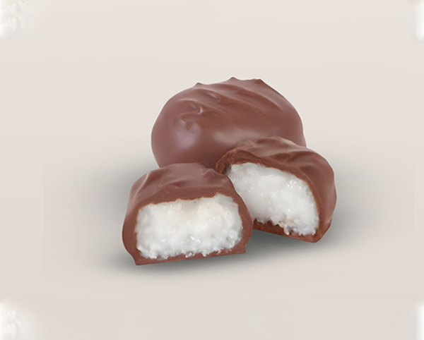
Crunchy Coco
cream choco bites
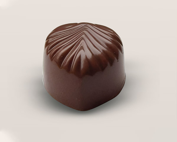
Full Cream
roasted nuts & fruity
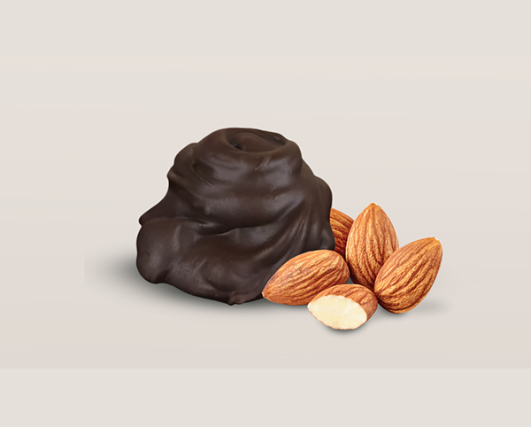
Nuts In & Nutty Fruity
<link rel="preconnect" href="https://fonts.googleapis.com">
<link rel="preconnect" href="https://fonts.gstatic.com" crossorigin>
<link href="https://fonts.googleapis.com/css2?family=Montserrat:ital,wght@0,100..900;1,100..900&family=Noto+Sans+JP:wght@100..900&family=Open+Sans:wght@300..800&display=swap" rel="stylesheet">
<meta name="viewport" content="width=device-width,initial-scale=1.0">

<style>
/* 2. DESIGN SETTINGS (CSS) */
:root {
  /* Set your Brand Color here */
  --brand-color: #932B33;
}

/* Container for all cards */
.product-cards-scope {
  font-family: 'Montserrat', sans-serif;
  margin: 2rem auto;
  max-width: 1200px;
}

/* The Grid Layout (3 Columns) */
.composable-grid {
  display: grid;
  grid-template-columns: repeat(3, 1fr);
  gap: 2rem;
}

/* RESPONSIVE: Tablet (2 columns) */
@media (max-width: 1024px) {
  .composable-grid { grid-template-columns: repeat(2, 1fr); }
}

/* RESPONSIVE: Mobile (1 column) */
@media (max-width: 767px) {
  .composable-grid { grid-template-columns: 1fr; }
}

/* Individual Card Styling */
._card {
  background: white;
  border-radius: 40px;
  padding: 16px;
  padding-bottom: 24px; /* Added padding for visual balance without button */
  position: relative;
  box-shadow: 0 20px 40px -14px rgba(0,0,0,0.12);
  display: flex;
  flex-direction: column;
  transition: all 0.3s ease;
}

/* Card Hover Animation */
._card:hover {
  transform: translateY(-8px);
  box-shadow: 0 30px 50px -14px rgba(147, 43, 51, 0.2);
}

/* Image Container */
._thumbnail {
  border-radius: 24px;
  overflow: hidden;
  aspect-ratio: 4 / 3; /* Shorter height */
}

/* The Image itself */
._thumbnail img {
  width: 100%;
  height: 100%;
  object-fit: cover;
  transition: transform 0.4s ease;
}

/* Category Label (Top Left) */
._category {
  position: absolute;
  top: 16px;
  left: 16px;
  background: white;
  padding: 8px 18px;
  border-bottom-right-radius: 16px;
  font-size: 0.75rem;
  font-weight: 800;
  color: var(--brand-color);
  text-transform: uppercase;
  z-index: 10;
}

/* Product Title Area */
.name-row {
  display: flex;
  justify-content: center;
  margin-top: 20px;
}

._heading {
  font-size: 1.25rem;
  font-weight: 800;
  color: #222;
  margin: 0;
}
</style>

<div class="product-cards-scope">
  <div class="composable-grid">

    <section class="_card">
      <div class="_category">toasted coconut</div>
      <div class="_thumbnail">
        <img src="https://cocoabuds.in/wp-content/uploads/2026/01/pr03.jpg" alt="Product 01">
      </div>
      <div class="name-row">
        <h2 class="_heading">Crunchy Coco
</h2>
      </div>
    </section>

    <section class="_card">
      <div class="_category">cream choco bites</div>
      <div class="_thumbnail">
        <img src="https://cocoabuds.in/wp-content/uploads/2026/01/pr02.jpg" alt="Product 02">
      </div>
      <div class="name-row">
        <h2 class="_heading">Full Cream</h2>
      </div>
    </section>

    <section class="_card">
      <div class="_category"> roasted nuts & fruity</div>
      <div class="_thumbnail">
        <img src="https://cocoabuds.in/wp-content/uploads/2026/01/pr01.jpg" alt="Product 03">
      </div>
      <div class="name-row">
        <h2 class="_heading">Nuts In &
Nutty Fruity</h2>
      </div>
    </section>

  </div>
</div>
4. The Process
<div class="expanding-cards-container">
    <div class="panel active" style="background-image: url('https://cocoabuds.in/wp-content/uploads/2026/01/Sli01.jpg');">
        <div class="content-overlay">
            <h3>Bean to Chocolate</h3>
            <p>Bean to chocolate is our promise of complete control over quality. By overseeing every step from sourcing cacao to creating the final bar.</p>
        </div>
    </div>
    <div class="panel" style="background-image: url('https://cocoabuds.in/wp-content/uploads/2026/01/Sli02.jpg');">
        <div class="content-overlay">
            <h3>Harvest</h3>
            <p>We start by hand-picking ripe cacao pods from our own farms. Only the fully mature ones make it in..</p>
        </div>
    </div>
    <div class="panel" style="background-image: url('https://cocoabuds.in/wp-content/uploads/2026/01/Sli03.jpg');">
        <div class="content-overlay">
            <h3>Fermentation</h3>
            <p>Next, the beans go into wooden boxes to ferment for a few days. This step builds real chocolate flavour.</p>
        </div>
    </div>
    <div class="panel" style="background-image: url('https://cocoabuds.in/wp-content/uploads/2026/01/Sli04.jpg');">
        <div class="content-overlay">
            <h3>Drying</h3>
            <p>Then they're laid out to sun-dry slowly. It locks the aroma and keeps quality high.</p>
        </div>
    </div>
     <div class="panel" style="background-image: url('https://cocoabuds.in/wp-content/uploads/2026/01/Sli05.jpg');">
        <div class="content-overlay">
            <h3>Roasting</h3>
            <p>Once dry, we roast the beans in small batches That's when the flavou really kicks in..</p>
        </div>
    </div>
    <div class="panel" style="background-image: url('https://cocoabuds.in/wp-content/uploads/2026/01/Sli06.jpg');">
        <div class="content-overlay">
            <h3>Grinding</h3>
            <p>The roasted beans are finely ground upto 16-20 microns into a smooth, rich chocolate paste - the base of every bar..</p>
        </div>
    </div>
    <div class="panel" style="background-image: url('https://cocoabuds.in/wp-content/uploads/2026/01/Sli07.jpg');">
        <div class="content-overlay">
            <h3>Tempering & Mouldings</h3>
            <p>The chocolate is carefully tempered to achieve that perfect snap, shine, and smooth texture, and poured into moulds..</p>
        </div>
    </div>
</div>

<style>
@import url('https://fonts.googleapis.com/css?family=Muli&display=swap');

.expanding-cards-container {
    font-family: 'Muli', sans-serif;
    display: flex;
    width: 100%;
    margin: 0 auto;
    box-sizing: border-box;
}

.panel {
    background-size: cover;
    background-position: center;
    background-repeat: no-repeat;
    height: 65vh;
    border-radius: 40px;
    color: #fff;
    cursor: pointer;
    flex: 0.5;
    margin: 10px;
    position: relative;
    overflow: hidden; /* Ensures gradient stays inside rounded corners */
    transition: all 700ms cubic-bezier(0.05, 0.61, 0.41, 0.95);
    -webkit-transition: all 700ms cubic-bezier(0.05, 0.61, 0.41, 0.95);
}

/* Dark Gradient Overlay for Readability */
.content-overlay {
    position: absolute;
    bottom: 0;
    left: 0;
    width: 100%;
    padding: 40px 20px 20px 20px;
    background: linear-gradient(to top, rgba(0,0,0,0.8) 0%, rgba(0,0,0,0) 100%);
    opacity: 0;
    transition: opacity 0.3s ease;
}

.panel h3 {
    font-size: 28px;
    margin: 0;
    transform: translateY(20px);
    transition: transform 0.5s ease;
    padding: 0 10px ;
}

.panel p {
    font-size: 15px;
    margin: 10px 0 0 0;
    opacity: 0.9;
    padding: 0 10px 10px;
}

.panel.active {
    flex: 5;
}

.panel.active .content-overlay {
    opacity: 1;
    transition: opacity 0.4s ease-in 0.4s;
}

.panel.active h3 {
    transform: translateY(0);
}

@media (max-width: 480px) {
    .expanding-cards-container {
        flex-direction: column; /* Stack vertically on mobile */
        height: 125vh;
    }

    .panel h3,
    .panel p {
        padding: 0px;
        margin-left: 2px; /* Optional: adds just a tiny bit of space so text doesn't hit the very edge */
    }
    .panel p{
        padding: 0px 0px 5px;

    }
    .panel {
        flex: 1;
        margin: 5px 0;
    }

  /* .panel:nth-of-type(4),*/
  /*  .panel:nth-of-type(5) {*/
     /*   display: none;*/
    }
}
</style>

<script>
document.addEventListener('DOMContentLoaded', function() {
    const panels = document.querySelectorAll(".panel");

    panels.forEach((panel) => {
        panel.addEventListener("click", () => {
            removeActiveClasses();
            panel.classList.add("active");
        });
    });

    function removeActiveClasses() {
        panels.forEach((panel) => {
            panel.classList.remove("active");
        });
    }
});
</script>